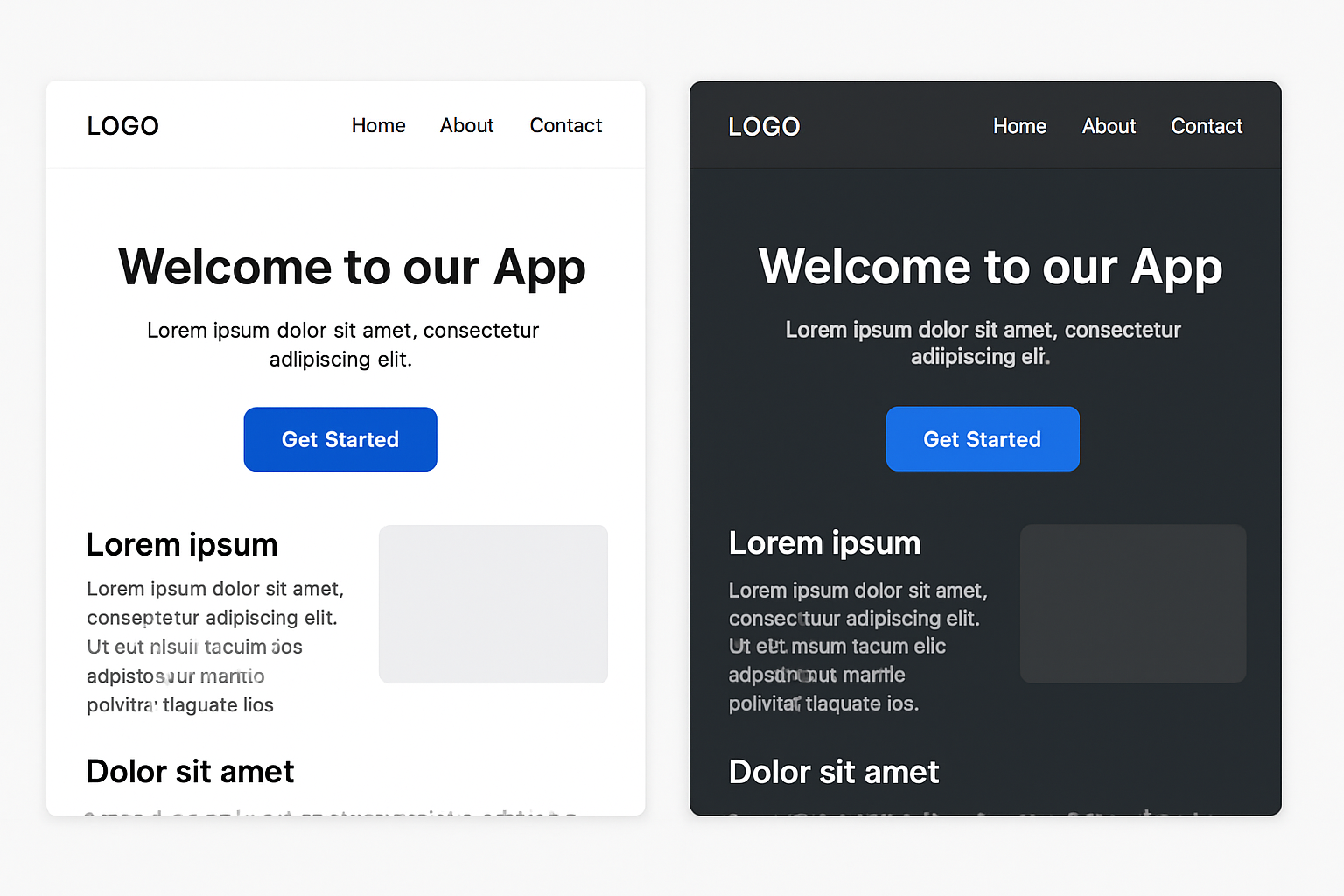 Dark mode has moved from being a novelty to a user expectation. But implementing it isn’t as simple as flipping your light palette into its darker twin. Done well, dark mode can reduce eye strain, save battery life on OLED screens, and give your product a sleek, modern aesthetic. Done poorly, it can create accessibility issues, muddy contrast, and leave users frustrated.
In this post, we’ll go beyond color inversion and break down the essential design principles for a dark mode experience that feels intentional and delightful.
1. Start with a Purpose, Not Just a Toggle
Before you design, ask: Why are we adding dark mode?
- Is it for accessibility (reduced glare, better low-light usability)?
- Is it for aesthetic appeal?
- Is it to keep up with user expectations?
Knowing the “why” ensures your design choices align with your brand and your users’ needs.
2. Don’t Just Invert Colors—Rebuild the Palette
Straight inversion often leads to awkward results: washed-out colors, unreadable text, and inconsistent brand identity.
- Rebuild your palette from the ground up, adjusting saturation and brightness for dark backgrounds.
- Avoid pure black (#000000) for large areas—deep charcoal or dark blue-grays feel softer and reduce glare.
3. Maintain Proper Contrast Ratios
Accessibility is non-negotiable. The WCAG recommends at least 4.5:1 contrast for normal text.
- Light text on dark backgrounds should have enough brightness without causing “halation” (the glow effect that strains eyes).
- Use tools like Contrast Ratio Checker to validate your choices.
4. Keep Brand Colors Vibrant—But Controlled
Bright colors can feel too loud against a dark backdrop.
- Slightly desaturate or lighten brand colors to maintain harmony.
- Use accent colors sparingly to guide attention without overwhelming.
5. Elevate Depth with Shadows and Layers
Dark mode can flatten your interface if you’re not careful.
- Use subtle shadows and depth effects to create separation between elements.
- Layer backgrounds with slightly varied dark tones for hierarchy.
6. Test in Real Use Cases
Don’t design dark mode in a vacuum—test it:
- In low-light environments
- On different screen types (OLED vs LCD)
- For prolonged reading and scanning sessions
7. Give Users Control
Dark mode is personal. Always offer:
- A toggle between light and dark modes
- An automatic setting that follows the device’s system preferences
Key Takeaway
Dark mode isn’t a simple switch—it’s a redesign. When you think about contrast, color harmony, accessibility, and depth, you create a dark mode that feels just as polished as your light theme—if not more so.